

Having been born in the early nineties, I thought it best to rank my 12 favourite non-blue and white Wednesday kits going back to when I was born, and it may be that a hint of nostalgia may have clouded my judgement… What do you think?
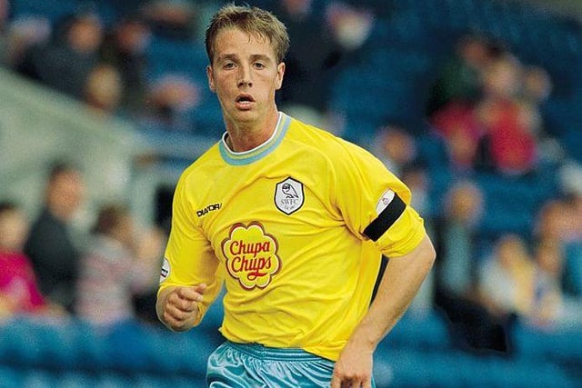
1. 12. A nice throwback...
I like this shirt because of it's nod to the early 90s. The yellow and baby blue pops nicely, and the Chupa Chups logo didn't stand out so badly on this one. (Craig Prentis /Allsport) Photo: Craig Prentis
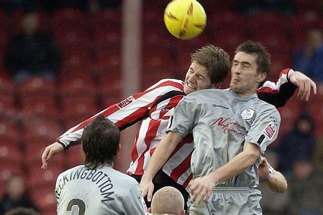
2. 11. Silver foxes...
I won't lie, I'm not sure how nice everybody else thinks this shirt is... I think I might be biased by the fact that we wore this in the season we got promoted - the year I went to my first final with Wednesday - and that's why I like it so much. (Photo by Ker Robertson/Getty Images) Photo: Ker Robertson
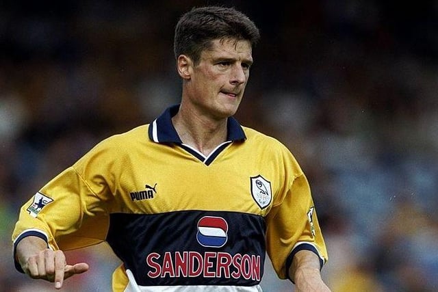
3. 10. A reminder of the Premier League...
This shirt reminds me of the Premier League. Carbone, Di Canio, Jonk, that era. Sadly, the last away shirt we wore in the top-flight. (Gary M Prior/Allsport) Photo: Gary M. Prior
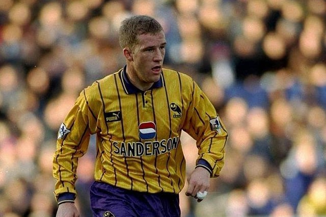
4. 9. Purple and gold? Really?
I don't think purple and gold have ever gone so well together... Mid-90s, this shirt with purple shirts and the old stylised owl, looks brilliant. Don't you think? (Mark Thompson/Allsport) Photo: Mark Thompson